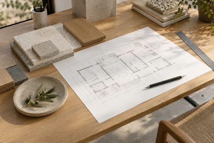
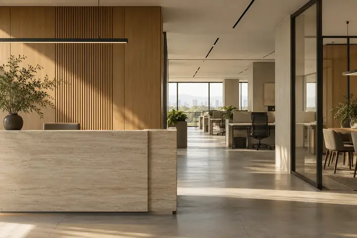
A minimal space is not an empty space. It is a place where the materials, proportions and practical details have been considered together. A smaller palette can give each decision more purpose.
Begin with the purpose of the room
The right palette starts with what happens in the space. A busy reception, a family living area and a workshop have different patterns of use. Surfaces need to suit the people, movement and routines they will encounter.
Describe those requirements before selecting colours. Cleaning needs, moisture, wear, glare and access for maintenance can all influence a sensible material discussion.
Choose a calm base
A restrained base gives the room continuity. Warm whites, stone tones, natural timber and carefully used dark metal can create a clear visual relationship between walls, floors and joinery.
The aim is not to prescribe a particular look. It is to choose a small group of materials that work together in the actual light of your space. Review samples next to one another, rather than deciding from separate photographs.
Let texture do some of the work
Texture can bring depth without adding another colour. The grain of timber, a softly textured wall and the fine surface of metal each respond differently to light.
Consider how those surfaces meet. A well-resolved edge, joint or transition can make a simple palette feel intentional. Those details should be discussed with the people responsible for fabrication and installation.
Look beyond the first impression
Ask how a finish will be cleaned, what regular care it needs and whether it is appropriate for the intended application. A material sample is a starting point, not a complete answer.
Bring practical questions into the selection process: can a damaged part be replaced, how will high-use edges be finished, and is there room to maintain the services behind a surface?
Check the palette in the right light
Materials can look different in a showroom, on a screen and at the project site. Daylight, artificial lighting and nearby surfaces all affect the way a room is perceived.
Where practical, review the shortlisted samples in the space and alongside the proposed lighting direction. A coordinated review is more informative than choosing each item in isolation.
Carry the idea through the details
Once a palette is agreed, use it to guide the smaller decisions: handles, frames, skirting, fixtures and visible service elements. Consistency does not require every item to match; it requires the relationships to make sense.
The strongest result is a space that feels natural to use. A clear brief and a coordinated material schedule help turn a simple idea into a considered finished environment.